Measuring Software Development Productivity

Measuring software development productivity is challenging in that there are no useful objective ways to measure it. Traditional approaches that strive for objectivity like counting lines of code, story points, or function points fall short in one way or another. In this post, I’ll review traditional approaches to software development productivity and discuss their shortcomings. Alternatives to these traditional methods will be discussed in a future post.

Motivation

If you can’t measure it, you can’t improve it.

Peter Drucker

If we can measure software development productivity we will know if changes we make to the people (e.g., individuals, roles, responsibilities), processes (e.g., scrum, kanban), or technology (e.g., language, IDE) are improving productivity or not. It would also be helpful to be able to compare the productivity of different software development teams and objectively measure the benefit (if any) of outsourcing.

Software Development Productivity Definition

What is software development productivity? In the business world, productivity is defined as the amount of useful output of a production process per unit of input (e.g., cost). Thus, software development productivity could be defined as the amount of quality software created divided by the resources expended to produce it. The denominator is fairly straightforward and could be measured as the cost of the software development effort (e.g., wages, benefits, tools, office and equipment costs). The numerator is the challenge.

Software development productivity is the amount of quality software created divided by the resources expended to produce it.

Note that quality must be taken into consideration when measuring the amount of software produced or the productivity measure will not be useful.

Quick Note on The Observer Effect

The Observer Effect is the idea that merely observing a phenomenon can change that phenomenon. Because there is additional overhead required to train the organization on productivity metrics and to measure and report on them, establishing a software development productivity measurement process could actually lower productivity because of the overhead. Measuring the productivity impact of a productivity measurement process is an interesting topic. Intuitively, the benefits of measuring productivity should outweigh the cost of the measurement process but I think it is a good idea to be aware of the added cost.

What We Want in a Productivity Measure

Ideally, our productivity metric would have the following properties:

  • Development team can’t game it to look more productive
  • Objective rather than subjective for consistency
  • Reasonably easy to measure (not a lot of overhead)
  • An absolute measure that can be used to compare productivity of different teams/organizations

Hours Worked

It may be hard to believe that hours worked would be a measure of software development productivity, but it is frequently used.

Hours Based Productivity = (total hours the team works) / (cost of the team)

If you compare the productivity of two software development teams using this measure, and they work the same number of hours, you will conclude that the less expensive team is more productive (i.e., that you will get more useful software produced per dollar of investment). This is often used as justification for moving software development offshore where labor rates are cheaper or the driver for a policy to hire the cheapest developers in a local market.

This is also used in some organizations as justification for encourage software developers to work more hours per week. Managers who use this productivity metric are focused on increasing the numerator (hours worked) and decreasing the denominator (cost).

The problem with this metric is that it assumes that every software developer produces the same amount of quality code per hour. This far from the truth. Studies have found that there can be an order of magnitude (10x) difference in productivity between programs and between teams. Alan Eustace (Google SVP) argued that a top notch developer is worth three hundred average ones. Bill Gates said that a great writer of code is worth 10,000 times the price of an average writer. Robert C. Martin said that ninety percent of code is written by ten percent of the programmers.

“A great lathe operator commands several times the wage of an average lathe operator, but a great writer of software code is worth 10,000 times the price of an average software writer.”

Bill Gates

“90% of the code is written by 10% of the programmers.”

Robert C. Martin

There is also a myth that the more time a developer spends in her seat, the more productive she will be (the greater the hours-worked numerator will be and the more quality code she will produce). As Tom DeMarco and Timothy Lister pointed out in their book PeopleWare, overtime will often lead employees to take compensatory undertime whenever possible, either through suboptimal work, leaving early, getting sick and so on. In essence, overtime is like sprinting: it’s great for the final stretch, but if you sprint for too long, you won’t be able to finish the race. It gives you the illusion of higher productivity.

Source Lines of Code (SLOC) Completed

Another measure of software development productivity that is used is counting the amount of code that has been written and dividing that by the cost to write it.

SLOC Productivity = (number of lines of code) / (cost to write the code)

There are different ways to count lines of code and a variety of code counting tools available. The term “source code” refers to the human-readable source code before it is compiled. There are several problems with using this as a measure of software development productivity.

The first issue is that not all SLOC takes the same amount of effort. For example, complex scientific code takes a lot longer than text boxes and radio buttons on a user interface. This has been addressed in software estimation tools like SEER-SEM and COCOMO by assigning a complexity factor to software products (e.g., an e-commerce website is less complex than an image processing system). But software cost estimation is not the same as measuring the productivity of a software development team. It is not practical to ask developers to assign a complexity measure to every software component they develop and it would be difficult to normalize this between developers. But there is another more serious problem of using SLOC as a productivity measure.

“Measuring software productivity by lines of code is like measuring progress on an airplane by how much it weighs.”

Bill Gates

The issue is that we strongly prefer software solutions with fewer lines of code than those with more code. One software developer’s implementation may be 50 lines of code and another’s might be 500 lines of code for the same functionality. The shorter the software solution, the easier it is to maintain. Most of the cost of software is in maintenance. The shorter code may also be more performant (e.g., requiring less computing resources, providing lower latency, more throughput). If we were to use quantity of SLOC as a productivity measure, we would think that a good programmer who creates efficient code is not as productive as a bad programmer that produces more verbose code which is wrong.

Function Points

The basic idea of Function Points (FP) is to quantify business functionality provided by software. There are formal methods for FP estimation and even ISO standards that govern the methodology. Function points are somewhat obscure in that they are rarely used at commercial companies in the US (they seem more popular in other countries). Allan Albrecht, the inventor of function points, observed in his research that FPs were highly correlated to lines of code and thus they share the same issues using them as a software development productivity measure. A large criticism of FPs is that like SLOC counting, they don’t take into account the complexity of the software being written. They work better for business software but not so well for software that has more algorithmic complexity (e.g., a data science application).

FP Productivity = (function points completed) / (cost to write the code)

The bottom line is that if a software development team completes 1000 function points one month and 1100 function points the next, you can’t conclude that their productivity increased 10%. That is because function points don’t take into account complexity (i.e., the software they developed in the second month might have been a lot easier than the first month). There is also significant overhead to assigning function points and it would be difficult to find staff with function point experience in the US.

User Story Points

Story Points are used by agile development teams to estimate the amount of effort it will take to complete a user story. They are typically used to determine how many user stories can be planned into a sprint (a time-boxed development cycle). They are very subjective measure that only has value within a team. Comparison to other teams, departments and organizations is not possible. A software development team can track its velocity (the number of story points completed each sprint) with a goal to improve it, but velocity can easily be gamed by the team. Since story points are completely subjective, the team can just estimate them to be higher and velocity will appear to increase. They are useful within the team to improve their own performance, but not as an external productivity measure.

SP Productivity = (story points completed) / (cost to write the code)

Use Case Points

Use Case Points (UCP) rely on the requirements for the system being written using use cases, which is part of the UML set of modeling techniques. The software size is calculated based on elements of the system use cases with factoring to account for technical and environmental considerations. The UCP for a project can then be used to calculate the estimated effort for a project. Thus UCP is only applicable when the documentation contains use cases (i.e., you have to write use cases for everything). UCP is also a highly subjective method, especially when it comes to establishing the Technical Complexity Factor and the Environmental Factor. Also, there is no standard way to write use cases.

UCP Productivity = (use case points completed) / (cost to write the code)

Subjective Measures of Productivity

As we have seen, useful, practical, comparative, objective measures of software development productivity simply do not exist. We’ve been searching for them for many decades to no avail. I believe the core reason for this is that software development is knowledge work and a complex creative endeavor. Vincent Van Gogh produced more than 2,000 artworks, consisting of around 900 paintings and 1,100 drawings and sketches. Frida Kahlo in her shorter lifetime produced approximately 200 paintings, drawings, and sketches. Which painter was more productive? Maybe one artist’s paintings took longer to create because they were more complex or required more careful thought or experimentation. How would one go about analyzing this to come up with a reasonable productivity metric?

In the absence of useful objective productivity measures, we must turn to subjective measures. I’ll discuss these approaches in a future post.

Organizational Bias in Software Architecture

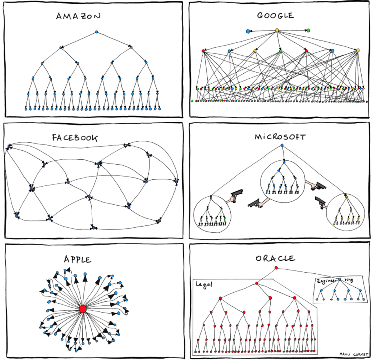
Organizational structure can bias the software architecture and lead to sub-optimal solutions. Why not align the organization with the architecture?

The architecture of a system tends to mirror the structure of the organization that created it. This idea was introduced by Melvin Conway way back in 1967 and still holds true today. Organizational bias to the architecture can be mitigated through awareness and with flatter, more flexible organizational structures.

Conway cited an example where eight people were assigned to develop a COBOL and an ALGOL compiler. After some initial estimates of difficulty and time, five people were assigned to the COBOL job and three to the ALGOL job. The resulting COBOL compiler ran in five phases, the ALGOL compiler ran in three! That probably wasn’t an optimal design and was clearly aligned with the organizational structure.

I’ll discuss a few other scenarios where Conway’s Law has manifested: website design, API architecture, and microservices architecture.

Website Design

The most obvious modern-day manifestation of Conway’s Law is in website design. We’ve all seen corporate websites that mirror the organizational structure of the company rather than follow a user-optimized design. What typically happens is that each organization develops and contributes its own content to the website and these pieces are then assembled together.

Home page
    - Division A webpages
    - Division B webpages
    - Division C webpages
Boeing website organized by divisions

A website user may not care about how the company is organized. She just wants a great website user experience. Also, how easily is the website maintained when there is an organizational restructuring?

API Architecture

We also sometimes see organizational structure reflected in API design. Take this example presented by Matthew Reinbold. Suppose that Team A creates a Users API as follows.

/users/{userId}/preferences

"preferences" : {
    "language" : "EN-US",
    "avatar" : "my-avatar.gif",
    "default-page : "settings"
}

Clearly, the intention is to have all the user’s preferences accessible via the “preferences” resource. Now suppose that sometime later, Team B is given the responsibility to develop a new feature that allows users to customize the sort order for their search pages and they need a place to save the user’s sort preferences. Because no one on Team B knows anyone on Team A, they are separated by a few time zones, don’t have the ability to add a high priority item to Team A’s backlog, and are on a tight schedule, they decide to create a new API under “preferences” and call it “sort.” They don’t need to involve Team A and can get this done very quickly. So they come up with something like this.

/users/{userId}/preferences/sort

"sort" : {
    "order" : "ascending"
}

The problem here is that even though this single design transgression in of itself doesn’t seem a big deal, it can proliferate and you can end up with a very chatty API like this that is difficult for clients to consume.

/users/{userId}/preferences/ooo
/users/{userId}/preferences/manager
/users/{userId}/preferences/timezone
/users/{userId}/preferences/signature

Microservices Architecture

If software development is functionally organized as in UI (front end), Services (back end), and Database teams, there will be an architectural bias along these lines. This can lead to sub-optimal microservices architectures. Ideally, there would be cross-functional teams with each team responsible for one or more microservices. James Lewis and Martin Fowler published an article on this topic.

With a functional organization as described above, there will be a bias for each team to address features within their functional area rather than across functional areas. You may end up with business logic in each layer of the architecture. Your services may not be as encapsulated as you would like.

Decoupling Architecture from Organization

So what can we do to avoid the pitfalls of Conway’s Law? I think the first step is awareness. Just like we need to be aware of other biases like confirmation bias and survivorship bias, an awareness of organizational bias can help our teams to actively work against it. But the organizational structure itself is a large factor.

  1. The flatter the organizational structure, the less likely it will bias the architecture. The flatter organizational structure should provide more of a blank sheet of paper rather than a set of constraints.
  2. The more flexible the organizational structure, the less likely it will bias the architecture. My view is that the organizational structure should mirror the architecture and not vice versa. Do the architecture first, then organize around it.
  3. The more communication within the organization, the less likely it will bias the architecture. If everyone knows what architecture decisions are made, there is a better chance that someone will speak up when Conway’s Law rears its ugly head, especially if awareness is raised throughout the organization.

Conclusion

Although Conway’s Law has been widely known in the software development community for many years, we still continue to see sub-optimal architectures biased by organizational structure. Software architecture organizational bias has manifested itself in many different scenarios including website design, API architecture, microservices architecture.

Organizational awareness is the first step to mitigate this and simple anecdotes can be included in group meetings and training sessions. But even better is to have a relatively flat organization with the flexibility to organize around the architecture of the product that is being developed.

In closing, I recently re-read Conway’s original paper, and found another somewhat humorous aphorism buried within. I’ll leave it here without further comment.

“Probably the greatest single common factor behind many poorly designed systems now in existence has been the availability of a design organization in need of work.”

Melvin Conway, 1967

Image credit Manu Cornet

What Makes a Good Manager?

The success of a company is largely determined by the quality of its management team. Thousands of authors have written on this topic over many decades. In this post, I’ll discuss Google’s approach to management as presented in the 2015 book, Work Rules!, by Lazlo Bock. Mr. Bock was SVP of People Operations at Google.

Eight Key Attributes of Good Managers

After extensive surveying and analysis, Google’s Project Oxygen Group identified eight key attributes of good managers.

  1. Be a good coach.
  2. Empower the team and do not micromanage.
  3. Express interest/concern for team members’ success and personal well-being.
  4. Be very productive/results-oriented.
  5. Be a good communicator – listen and share information.
  6. Help the team with career development.
  7. Have a clear vision/strategy for the team.
  8. Have important technical skills that help advise the team.

Providing Managers With Upward Feedback

Google continuously improves the performance of its managers with respect to these attributes by providing them feedback from their employees through bi-annual upward feedback surveys that ask the following questions.

  1. I would recommend my manager to others.
  2. My manager assigns stretch opportunities to help me develop in my career.
  3. My manager communicates clear goals for our team.
  4. My manager gives me actionable feedback on a regular basis.
  5. My manager provides the autonomy I need to do my job (i.e., does not “micro-manage” by getting involved in details that should be handled at other levels).
  6. My manager consistently shows consideration for me as a person.
  7. My manager keeps the team focused on priorities, even when it’s difficult (e.g., declining or deprioritizing other projects).
  8. My manager regularly shares relevant information from their manager and senior leadership.
  9. My manager has had a meaningful discussion with me about my career development in the past six months.
  10. My manager has the technical expertise (e.g., technical judgment in Tech, selling in Sales, accounting in Finance) required to effectively manage me.
  11. The actions of my manager show they value the perspective I bring to the team, even if it is different from their own.
  12. My manager makes tough decisions effectively (e.g., decisions involving multiple teams, competing priorities).
  13. My manager effectively collaborates across boundaries (e.g., team, organizational).
  14. What would you recommend your manager keep doing?
  15. What would you have your manager change?

Manager Performance Results

In a two-year period at Google, overall scores went from 83% to 88% favorable and the worst managers went from 70% to 77% favorable. That’s an impressive result. Google put a lot of effort into discovering what makes a person a great manager and how to encourage their managers become better managers. While every company is different, why not start with this and then make any necessary adjustments for your specific culture/environment?

Coaching versus Micromanaging

Google’s second “Good Manager” attribute is to empower the team and not micromanage. Managers dread being labeled as micromanagers because of the negative connotations (i.e., “no one wants to work for a micromanager”). Micromanagers tend to exhibit the following behaviors.

  1. Tell employees how to do things rather than what to do.
  2. Perform tasks and make decisions themselves rather than delegating to their employees.

I think it is important to understand the relationship between coaching and micromanaging. Take for example the Apprenticeship Model (i.e., apprentice, journeyman, master) as it relates to a technology organization. If a manager has an employee who is operating at the apprentice level in a certain area, it is entirely appropriate to “micromanage” them as a coaching tactic until they gain experience and knowledge enough to perform certain tasks on their own.

Advising versus Micromanaging

Google’s eighth “Good Manager” attribute is to have important technical skills to help advise the team. Sometimes there is a fine line between advising and telling the team what to do. I’ve found that the best approach is to ask questions rather than telling people what to do. Asking the right questions can guide people’s thinking and help them arrive at the best solutions.

Conclusions

I think that Google’s upward feedback survey is a great way to evaluate managers and help them improve. But care must be taken when evaluating coaching and advising behaviors versus micromanaging.

Management performance – Do the right thing well

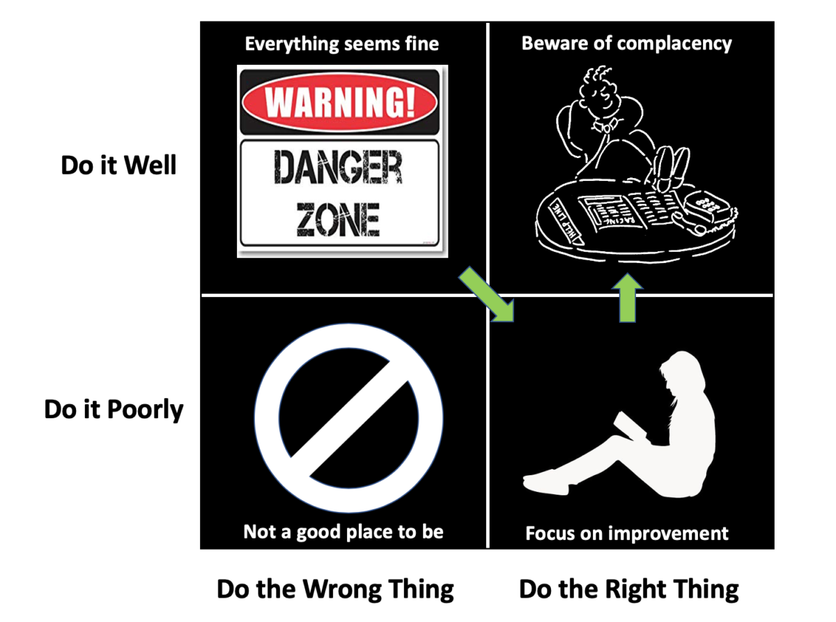
The Management Performance Matrix is an excellent tool for keeping your organization focused on doing the right thing and doing it well

The Performance Matrix is a simple and valuable tool. It was introduced in a 2011 Harvard Business Review article by Thomas J. DeLong. The horizontal dimension of this matrix (see the graphic above) is a measure of the “rightness” of what you are doing. Are you doing the “right” thing or the “wrong” thing? The vertical dimension is how well you are doing it.

This performance matrix can be applied to nearly everything that is going on in an organization. I’ve found it useful to step back from the swirl from time to time and think about what my team is doing in this context. Software architecture, software development process, security, people management, vendor management, and product management are some of the areas where this can be applied.

Beware of the Danger Zone

The top left quadrant is the “danger zone” because everything seems to be going well and you may not realize you are in trouble. You are executing to a plan, implementing decisions that have been made, and your team is productive and happy. But you might be on the wrong path. It’s not uncommon to have started doing the right thing but something changed in the environment to put you on the wrong path. It is important to recognize this as soon as possible and get moving over to the right.

One example is choosing to use a language or framework that is the latest “shiny object.” Often it doesn’t live up to its hype and support for it eventually fades away. It might have seemed like a good idea at the time, but didn’t turn out to be a good bet. At some point, you may need to move away from it.

Doing the right thing

When you you come to the conclusion that you are doing the wrong thing, it is often difficult to jump directly to the top right (doing the right thing well). Often, you end up starting off doing the right thing not so well (or “poorly”) and then work to get better at it. One example is switching your organization to a new software development process they are not familiar with. You can expect it will take some time for them to become proficient at it and move you from the bottom to the top where you want to be. One thing to note is that there really isn’t a binary “poorly / well” or “right / wrong,” there is a continuum of “worse” and “better.”

Avoid complacency

Arriving at the promised land in the top right quadrant (doing the right thing well) doesn’t mean you are done. There is danger in complacency. The environment can change. There may be better solutions emerging. Periodic management performance matrix checkups in key areas can be highly beneficial to avoid the complacency trap.